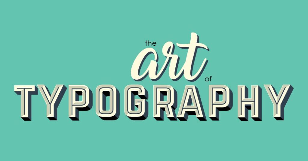
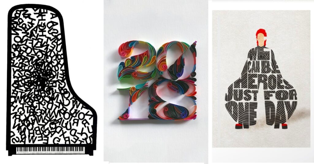
Typography plays a crucial role in brand identity and design. The right choice of fonts can convey the personality, values, and messaging of a brand. In this article, we will explore the art of typography and provide insights into choosing the right font for your brand. Whether you’re designing a logo, creating marketing materials, or developing a website, understanding the principles of typography will help you make informed decisions that align with your brand’s visual identity.
I. Understanding Typography:
Typeface vs. Font: To better understand typography, it’s important to differentiate between typefaces and fonts. A typeface refers to a collection of characters that share similar design characteristics, while a font is a specific variation of a typeface, such as its size, weight, or style.

Serif, Sans Serif, and Display Fonts: Serif fonts have small decorative lines or strokes at the ends of characters, which can convey a more traditional or formal tone. Sans serif fonts, on the other hand, lack these embellishments and often have a more modern and clean aesthetic. Display fonts are unique and distinctive, designed for use in headlines and larger sizes to make a bold statement.
II. Considerations for Choosing Fonts:
- Brand Personality and Values: Select fonts that align with your brand’s personality and values. Consider whether you want to convey a sense of modernity, elegance, playfulness, professionalism, or any other desired image. The right font can evoke specific emotions and create a cohesive brand identity.
- Legibility and Readability: Prioritize legibility and readability when choosing fonts. Ensure that the characters are distinguishable and easy to read across various mediums and sizes, including digital screens and print. A font that is difficult to read can detract from the message and frustrate the audience.
- Hierarchy and Contrast: Use different fonts to establish a visual hierarchy and create contrast within your design. By selecting fonts with distinct characteristics, such as varying weights or styles, you can guide the viewer’s attention and emphasize important information. Creating contrast in typography enhances the overall visual impact and improves readability.
- Compatibility and Consistency: Consider the compatibility of your chosen fonts across different devices, browsers, and operating systems. Some fonts may not be universally available or may display differently, which can affect the consistency of your brand’s visual identity. Limiting the number of fonts used across your brand assets ensures consistency and maintains a cohesive look and feel.
III. Best Practices for Typography:
- Pairing Fonts: Font pairing involves combining different fonts to create a harmonious and visually appealing composition. Consider contrasting font characteristics, such as weight, style, and size, to create a balanced and complementary pairing. Experiment with different combinations to find the ones that best convey your brand’s tone and message.

- Font Sizing and Scaling: Optimize font sizing and scaling for various mediums and devices. Consider readability, hierarchy, and the user experience when determining font sizes. For digital platforms, responsiveness is key, as fonts should adapt and scale appropriately to different screen sizes. Strike a balance between legibility and aesthetic appeal to ensure a positive user experience.
- Whitespace and Line Spacing: Whitespace, or negative space, plays a vital role in typography. It provides visual breathing room and enhances legibility by separating elements and improving overall readability. Consider line spacing, or leading, to ensure that there is enough vertical space between lines of text, preventing overcrowding and enhancing readability.
- Accessibility Considerations: Pay attention to accessibility guidelines when selecting fonts. Consider factors such as high contrast between text and background for improved legibility, particularly for people with visual impairments. Ensure that your typography choices meet accessibility standards and accommodate a wide range of users.
In conclusion, typography is an art form that significantly influences brand perception and communication. By understanding the principles of typography and considering factors such as brand personality, legibility, hierarchy, and compatibility, you can choose the right fonts that effectively represent your brand. Thoughtful font selection and implementation contribute to a cohesive and visually appealing brand identity that resonates with your target audience.

Key Takeaways:
- Typography is a critical element of brand identity and design.
- Consider your brand’s personality, values, and target audience when choosing fonts.
- Prioritize legibility, readability, and visual hierarchy in font selection.
- Pair fonts harmoniously and use whitespace effectively for balanced design.
- Ensure font accessibility and compatibility across different devices and platforms.
Contact us today to discuss your typography needs and create a captivating brand presence.

Leave a Reply