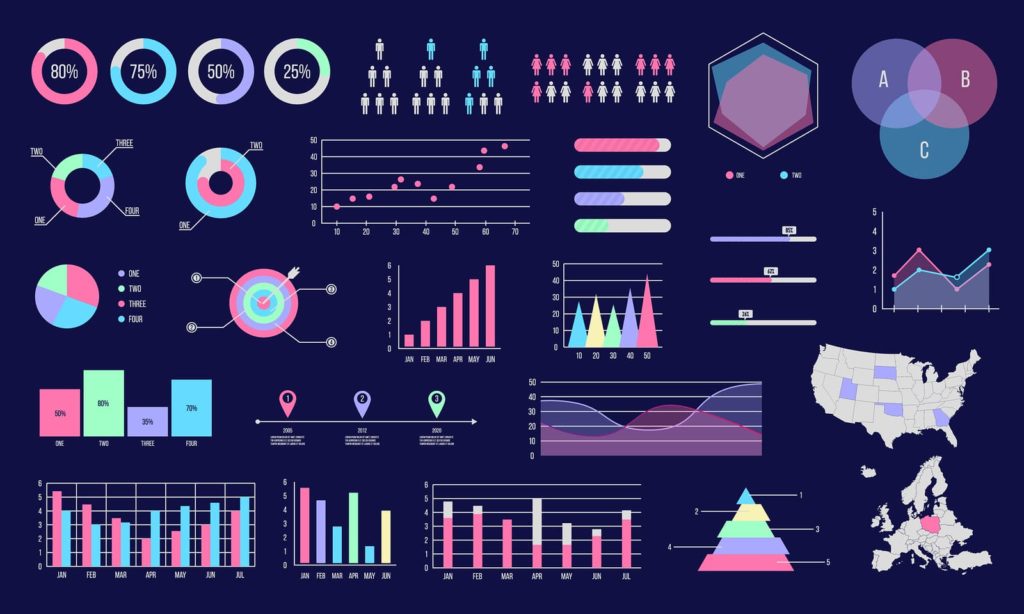
Infographics and data visualizations are powerful tools that can help communicate complex information in a simple and engaging way. They are used by businesses, non-profits, and governments to convey important messages, tell stories, and showcase data. However, not all infographics and data visualizations are created equal – some are clear and effective, while others are confusing and ineffective. In this article, we will share our approach to creating effective infographics and data visualizations that grab attention, communicate information clearly, and leave a lasting impression.
I. Define Your Purpose and Audience
Before you start creating an infographic or data visualization, it’s important to define your purpose and audience. What message do you want to convey? Who is your target audience? By answering these questions, you can tailor your design to ensure that it is relevant, useful, and interesting to your intended audience.

- Create a clear and specific objective for the infographic or data visualization
- Identify your target audience and their needs
- Analyze the data and identify key insights
- Develop a narrative that tells a story with the data
- Choose the appropriate visual form of communication that best represents the data
II. Design for Clarity
Clarity is essential when it comes to designing infographics and data visualizations. You want your message to be easily understood by your audience, so they can quickly grasp the key points and take action based on them.
- Keep the design simple and uncluttered
- Use colors and fonts consistently
- Use visuals that are easy to understand
- Ensure that the text is readable
- Avoid using jargon or overly technical language
III. Emphasize Key Information
To make your infographic or data visualization effective and memorable, it’s important to emphasize the most important information. This ensures that your message is not only clear but also memorable.

- Use a strong visual hierarchy to emphasize important information
- Use contrast to make key points stand out
- Use size and scale to create emphasis
- Use annotations to highlight specific data points
IV. Tell a Story
Infographics and data visualizations are not just about presenting data, but also about telling a story. By creating a narrative structure for your infographic or data visualization, you can help your audience understand the context of the data and how it relates to their lives.
- Create a narrative structure that guides the reader through the data
- Use personal anecdotes or case studies to illustrate key points
- Use images and graphics to enhance the storytelling
V. Test and Iterate
Finally, it’s important to test and iterate on your infographic or data visualization to ensure that it is effective. This means getting feedback from your target audience and making changes based on that feedback.

- Test your design with a small group of people
- Analyze the feedback and make changes
- Test again until you achieve the desired results
In conclusion, creating effective infographics and data visualizations requires careful planning, design, and testing. By following our approach, you can create infographics and data visualizations that are clear, engaging, and persuasive. Remember to define your purpose and audience, design for clarity, emphasize key information, tell a story, and test and iterate. With these principles in mind, you can create infographics and data visualizations that effectively communicate complex information to your intended audience.
Key takeaway points:
- Defining your purpose and audience is essential to creating an effective infographic or data visualization.
- Clarity should be a top priority when designing infographics and data visualizations.
- Emphasizing key information helps make your message memorable.
- Telling a story can help your audience understand the context of the data.
- Testing and iterating is crucial to ensuring that your infographic or data visualization is effective.
Contact us if you have any further questions.
Leave a Reply