Color plays a significant role in design and has a profound impact on human psychology and emotions. Understanding the psychology of color is crucial for effective design, as it can influence how people perceive and interact with visual content. In this article, we will delve into the psychology of color in design and explore how different colors evoke specific emotions and reactions. We will discuss the psychological effects of various colors and provide insights on how to effectively use color in design to create engaging and impactful experiences for the audience.
I. The Power of Color Psychology:
- Cultural and Contextual Influences: The meaning and symbolism of colors can vary significantly across different cultures and contexts, making it crucial for designers to consider these factors when incorporating color into their designs. Colors that hold positive connotations in one culture may have negative associations in another. By understanding cultural influences, designers can ensure that their use of color is appropriate and effective in communicating the intended message across diverse audiences.
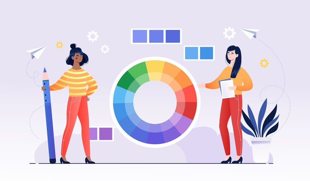
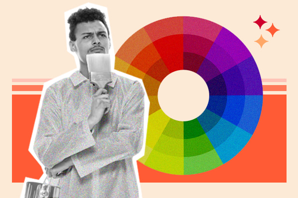
- Emotional Associations: Colors have a powerful impact on our emotions and can evoke specific feelings and reactions. For example, warm colors like red, orange, and yellow are often associated with energy, passion, and warmth. They can create a sense of excitement, enthusiasm, and urgency. On the other hand, cool colors such as blue, green, and purple are often linked to calmness, tranquility, and relaxation. They can convey a sense of trust, reliability, and stability.

- Symbolism and Meaning: Colors also carry symbolic meanings that can vary across different cultures and contexts. For example, in Western cultures, white is often associated with purity and innocence, while in some Eastern cultures, it is associated with mourning and loss. Similarly, red can symbolize luck and prosperity in some cultures, while in others, it may symbolize danger or warning.
II. Exploring the Effects of Different Colors:
- Warm Colors: Warm colors, such as red, orange, and yellow, have inherent qualities that make them particularly effective in certain contexts. They are often associated with energy, passion, and warmth. Red, for instance, can evoke strong emotions and grab attention, making it suitable for creating a sense of urgency or importance. Orange is often associated with enthusiasm and creativity, making it a good choice for designs that aim to inspire or stimulate. Yellow, with its brightness and vibrancy, can evoke feelings of happiness and optimism.
- Cool Colors: In contrast to warm colors, cool colors like blue, green, and purple are often associated with calmness, tranquility, and relaxation. Blue, with its soothing and calming effect, is often used to create a sense of trust and serenity. Green is associated with nature, growth, and harmony, making it a suitable choice for designs related to environmental or health themes. Purple, often associated with luxury and spirituality, can add a touch of elegance and sophistication to a design.

- Neutral Colors: Neutral colors, such as white, gray, and black, have a versatile and timeless appeal. They provide a solid foundation and can serve as a backdrop for other colors or elements in a design. White symbolizes purity and simplicity, while gray represents neutrality and balance. Black, with its elegance and sophistication, can add a sense of power and formality to a design. These neutral colors are often used to create contrast, highlight important elements, or evoke a sense of sophistication and minimalism.
III. Applying Color Psychology in Design:
- Branding and Identity: Colors play a crucial role in branding and identity design as they can convey the personality, values, and emotions associated with a brand. By carefully selecting colors that align with the brand’s desired image and target audience, designers can evoke specific emotions and create a strong visual identity that resonates with consumers. For example, a healthcare brand may choose blue to convey trust and reliability, while a youthful and energetic brand may opt for vibrant and bold colors like red or orange.
- Visual Hierarchy and Attention: Color can be used strategically to guide the viewer’s attention and create a visual hierarchy in a design. Bright and contrasting colors can be employed to draw attention to important elements or calls to action. By using color to differentiate between primary and secondary information, designers can effectively guide the viewer’s focus and enhance the overall user experience.

- Communication and Messaging: Colors have the power to enhance the message and reinforce the desired emotions or actions associated with a design. For instance, warm and vibrant colors may be used to create a sense of excitement and urgency in a sale promotion, while cool and soothing colors can convey a sense of calmness and relaxation in a healthcare campaign. By understanding the emotional associations and cultural meanings of different colors, designers can select colors that align with the intended message and effectively communicate with their target audience.
In conclusion, the key takeaways from this article are:
- Colors have psychological associations and can evoke specific emotions and reactions.
- Warm colors convey energy and excitement, while cool colors evoke calmness and reliability.
- Neutral colors provide versatility and can be used to create balance and contrast.
- Choosing the right colors in design can enhance brand identity, guide attention, and reinforce messaging.
Contact us today to discuss your design needs and unlock the potential of color psychology.
Leave a Reply